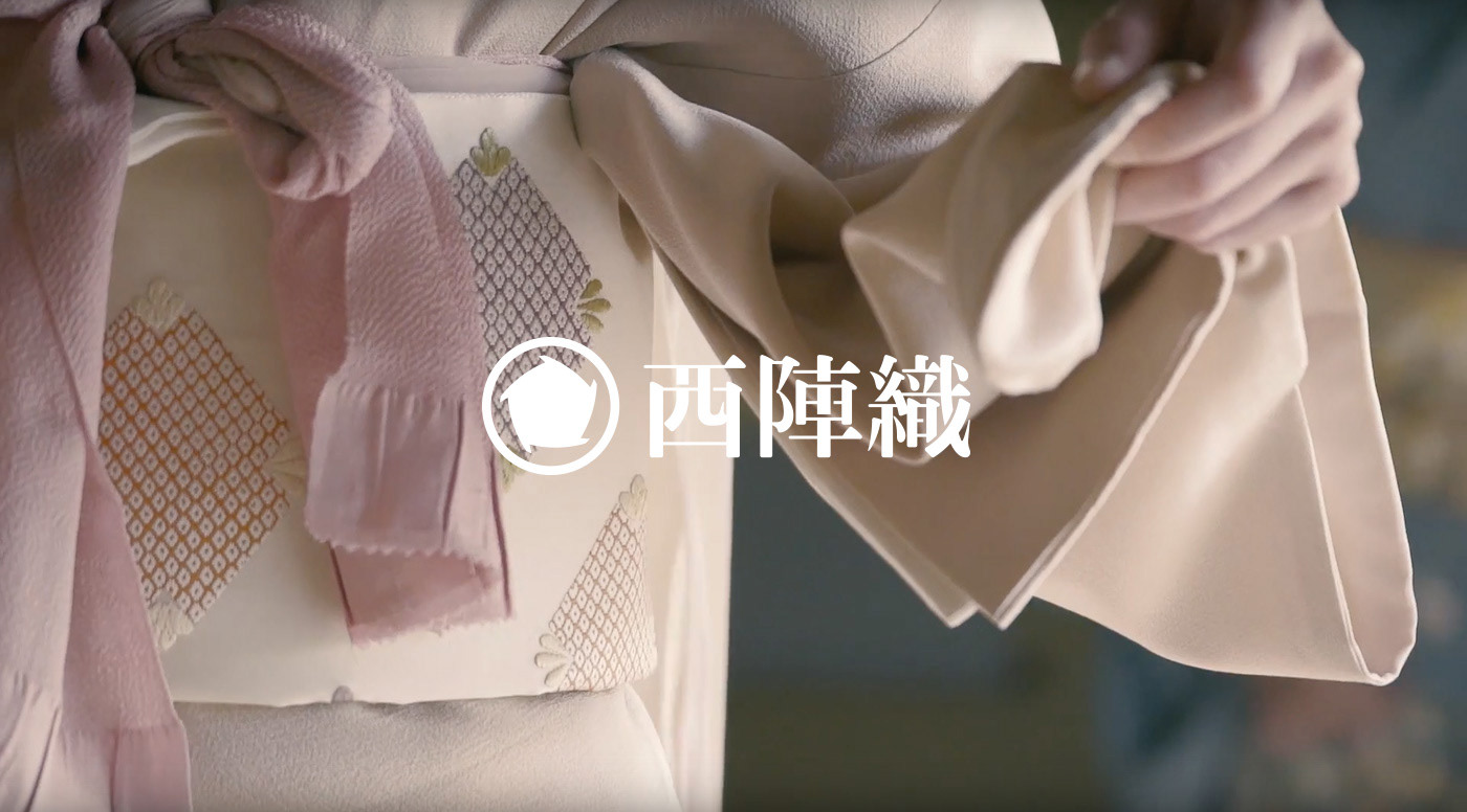
Nishijin-ori
Nishijin-ori, with its 1500 years of history since its origin, is a proud traditional silk fabric of Japan charactrized by its delicate and sophisticated Mon-ori (traditional Japanese pattern weaving) and finesse. However, just as other Japanese traditional industries, Nishijin-ori is also following the gradual path of decline. The decline is due to various factors: lower kimono wearing rate in Japan, less buyers, high price band for its high quality making it unaffordable for young people, aging of producers, etc..
Until now Nishijin-ori experienced hardships and declines many times in its long history. However, it has made phoenix-like comebacks whenever it adopted a new technology or innovative idea. If history repeats itself in a cycle, by adopting technologies and ideas further, with transformation and revolution, now should be the right time to say Nishijin-ori is making its comeback once again.
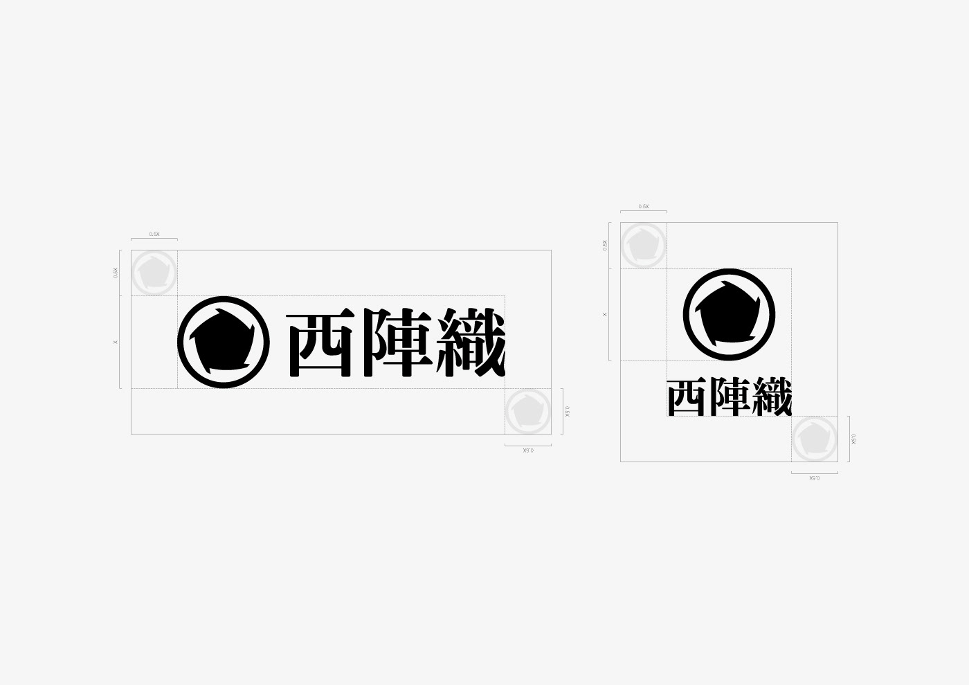
For Nishijin-ori which never had a logo, we, enhanced Inc., took part in structuring a new logo system as part of “co-creation project with Kyoto’s traditional industry” which is run by MTRL KYOTO and the young Nishijin-ori craftsmen group Nishijin Rengou Seinen-Kai (meaning Nishijin youth union association).
西陣織とは, その発祥から数えて約1,500年もの歴史を持つ, 繊細で精緻な紋織と技巧が特徴の日本が誇る伝統的な絹織物である.
日本における他の伝統産業同様, 西陣織もまた緩やかな衰退の道を辿っている. 日本国内での着物着用率の低下, 購入者数の減少, 高品質であるがゆえ若年層が購入しづらい価格帯, 生産業者の高齢化等, さまざまな要因によってである.
これまで西陣織は, その長い歴史の中で幾度も衰退の憂き目を見てきた. しかし, 新しい技術や革新的アイデアを採り入れる度に不死鳥のように再起してきた.
歴史は循環しながら繰り返す. 西陣織がさらに新しい技術や革新的アイデアを採り入れ, 変化/変革を伴った再起を果たすべき時期が訪れたのだと言えよう.
今回私たちenhancedでは, MTRL KYOTOと西陣織の若手職人集団「西陣連合青年会」が手がける「京都の伝統産業との共創プロジェクト」の一環として、今までロゴが存在しなかった西陣織の新しいロゴシステム構築に携わった.

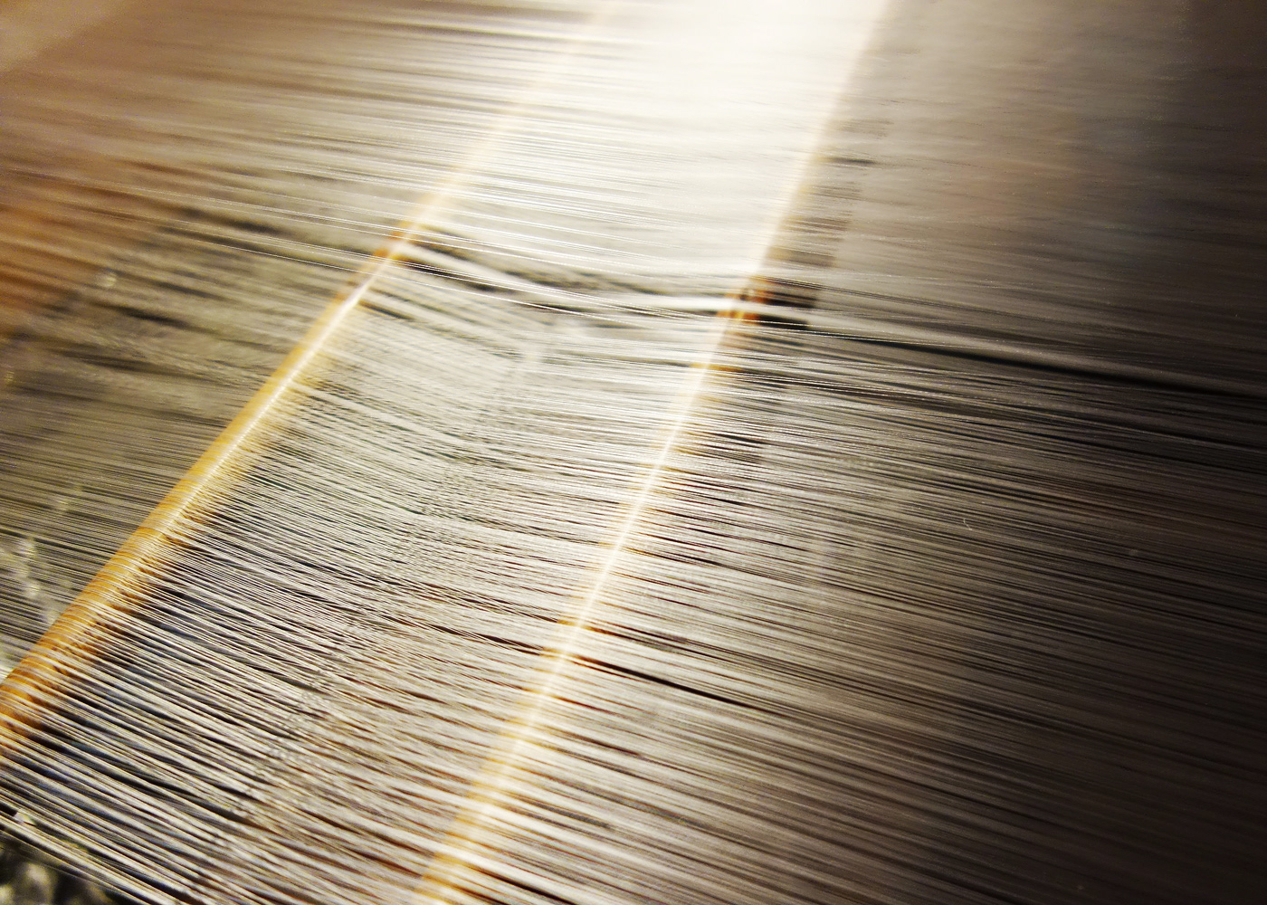
Manufacturing Process of Nishijin-ori
Nishijin-ori, a “Mon-orimono: fabric with Mon patterns” in which pre-dyed silk weaves out patterns, requires a number of steps before completion. Nishijin-ori production area of Kyoto (town) provides such manufacturing processes as a labor system unit, consisting of roughly five processes.
絹糸を使用する先染めの紋織物 (染色した糸を使って模様を織り出す織物) である西陣織は, 織りあがるまでに多数の工程を必要とする. これらの生産行程は京都の西陣織生産エリア (街) が1つのユニットとなった分業システムによって行われており, 大別すると5つに分類される.


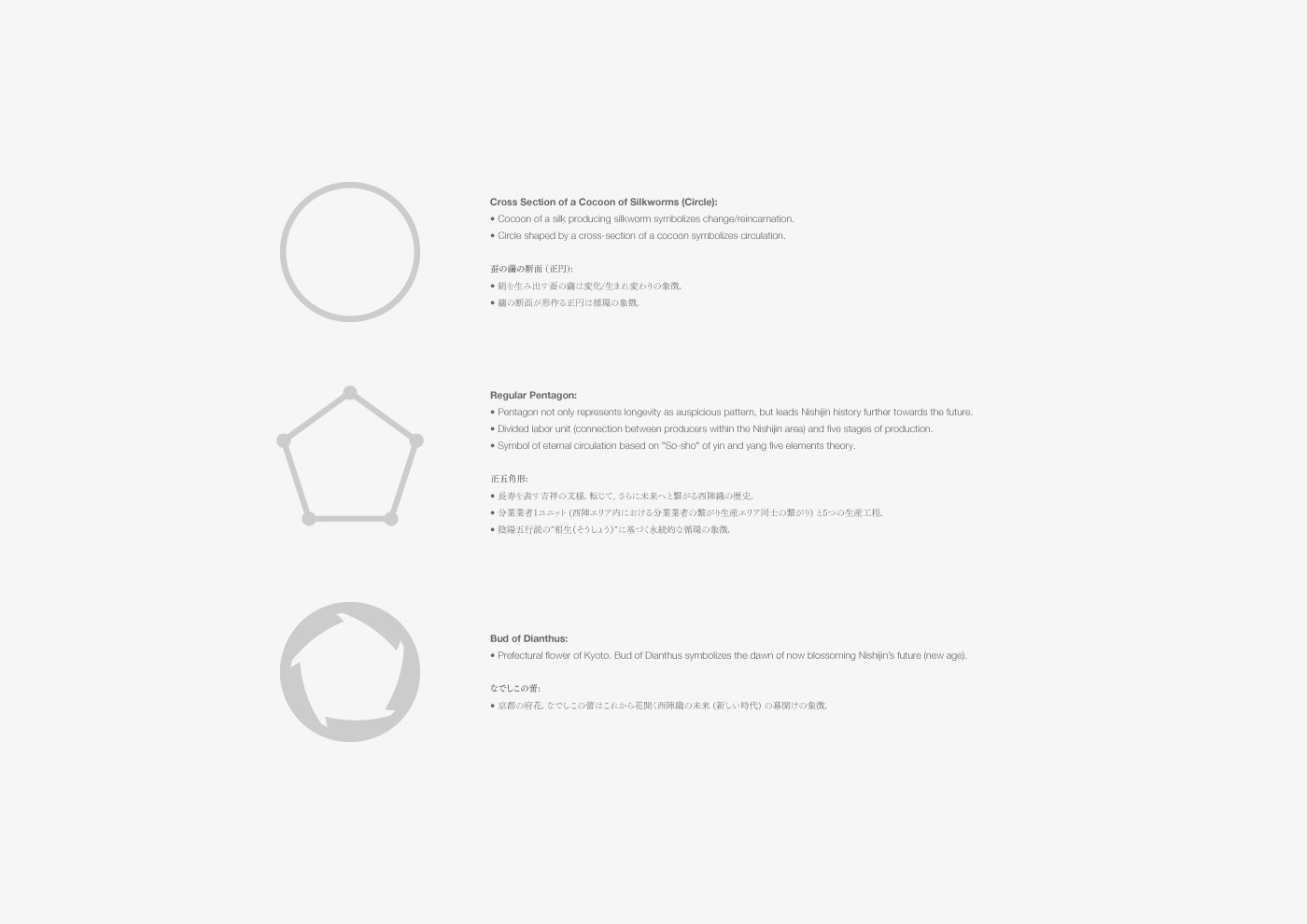
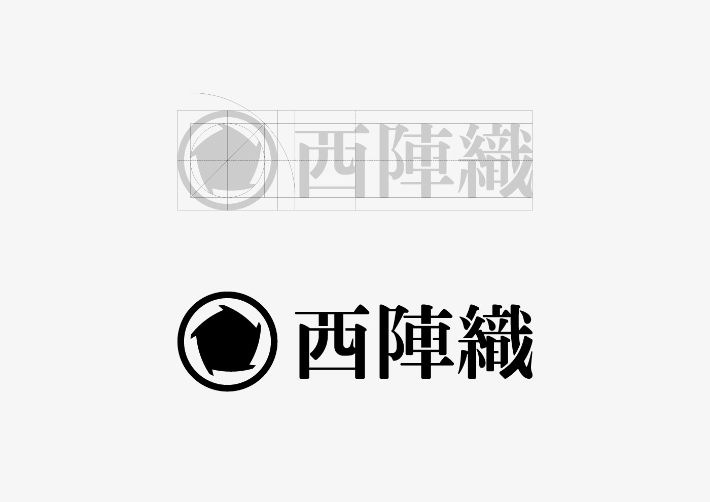
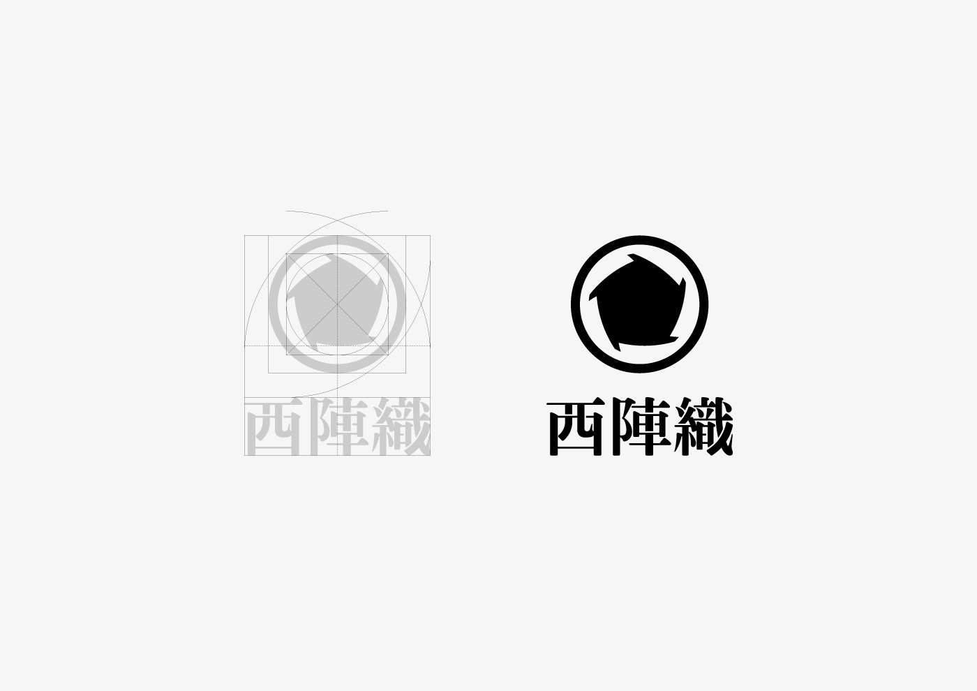
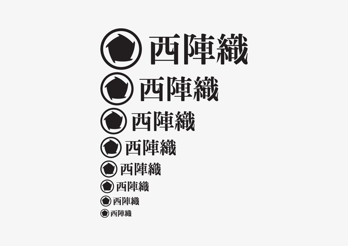
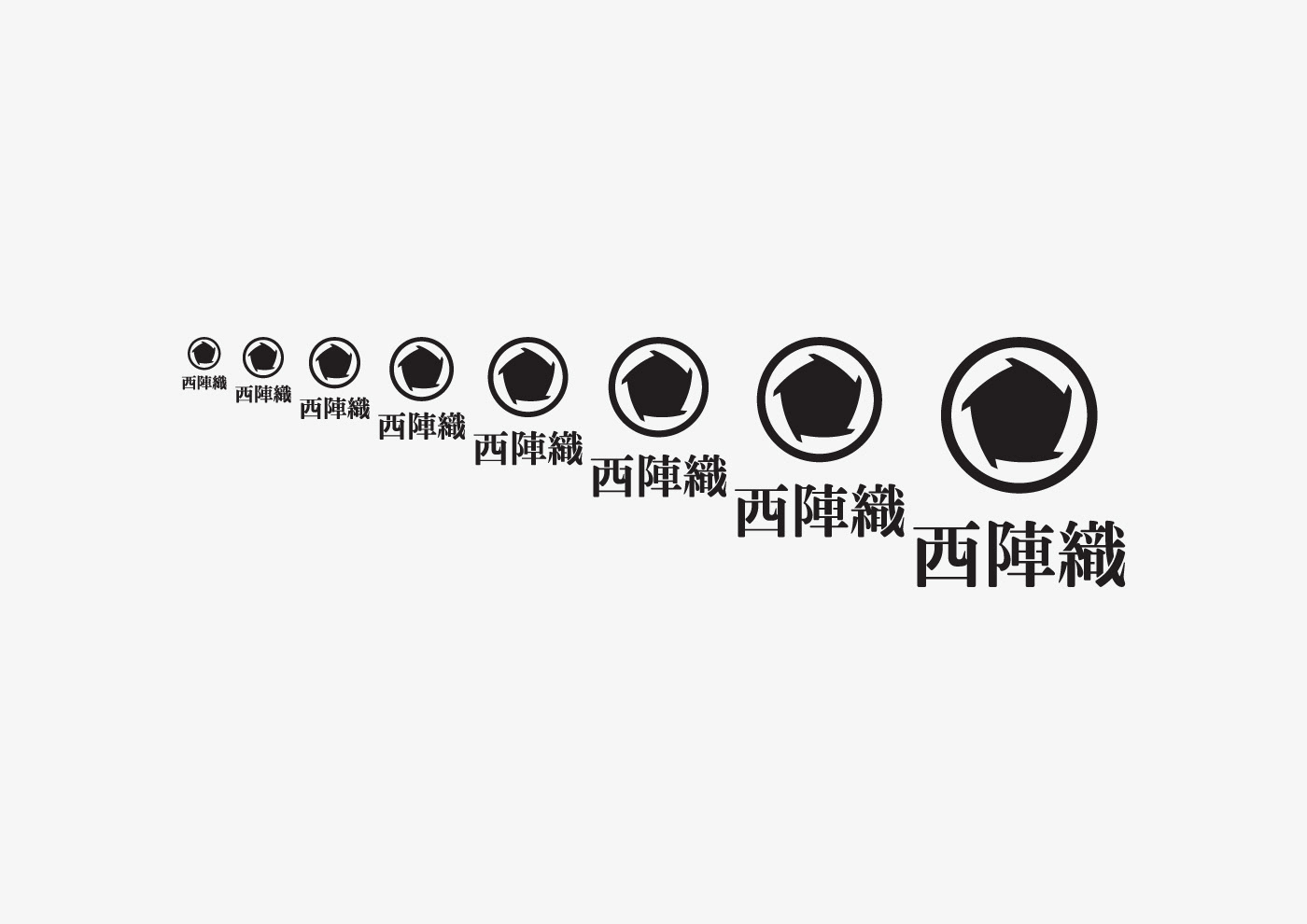
Metaphors of Symbol
In designing the Nishijin-ori logo system, first we focused on the two items below.
A. Silk Yarn:
Silk is generated from the cocoon of farmed silkworms. Silkworm, an insect with perfect metamorphosis, turns into a pupa in the cocoon and changes its appearance by emergence. Therefore, we can say pupa and cocoon symbolize change and reincarnation.
B. Divided Labor System in which a Town Gathering Various Producers Functions as a Single Unit:
A divided labor system of Nishijin-ori has five manufacturing steps. Also, the figure five has a special meaning in Japan (especially Kyoto).
• In Japan, pentagon represents the crane (longevity) as a pattern of good luck.
• In the yin and yang five elements theory, five vertices of a pentagon correspond to tree / fire / soil / gold / water. Vertices connected by a side line of the pentagon are mutually taken advantage of each other in “interdependent” relationship, called “So-syo” representing infinite circulation. Kyoto, based on the yin and yang five elements theory, was the land of “Shi-shin so-ou” (four gods’ reasonable relocation) hence the city was made a capital (794, Heian-Kyo) by Emperor Kanmu.
• Nadeshiko (Dianthus), the Kyoto prefecture flower, has five petals.
• To add, fine and delicate Nishijin-ori is weaved with five fingers.
Based on the above elements, below three symbols were defined as metaphors.
西陣織のロゴシステムを構築するにあたり, まず私たちは以下2の項目にフォーカスした.
A. 絹糸:
絹は家畜化された蚕の繭から生み出される. 蚕は, 繭の中で蛹となり, 羽化することでその姿を変える完全変態の昆虫である. 蛹や繭は変化や生まれ変わりの象徴と言える.
B. 様々な生産業者が集まった街が一つのユニットとして機能する分業システム:
西陣織の分業システムによる製造行程は5つである. また, この5という数字は日本 (特に京都) においては特別な意味を持つ.
• 日本において, 正5角形は鶴 (長寿) を表す吉祥の文様である.
• 陰陽五行説においては, 正五角形を形成するそれぞれの頂点が, 木/火/土/金/水に対応し, 五角形の辺で結ばれた隣の頂点は互いに生かしあう”相生 (そうしょう)”の関係にあり無限の循環を表す. 京都はこの陰陽五行説に基づき四神相応 (ししんそうおう) の地として桓武天皇により遷都 (794年, 平安京)された都市である.
• 京都の府花であるなでしこは5花弁である.
• 付け加えるなら、精緻で繊細な西陣織を紡ぐ指も5指である.
これらの要素から,以下の3つをシンボルのメタファーとして定めた.

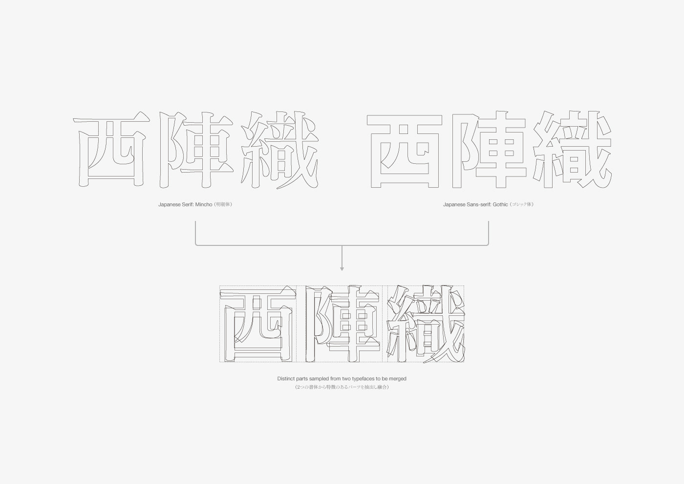
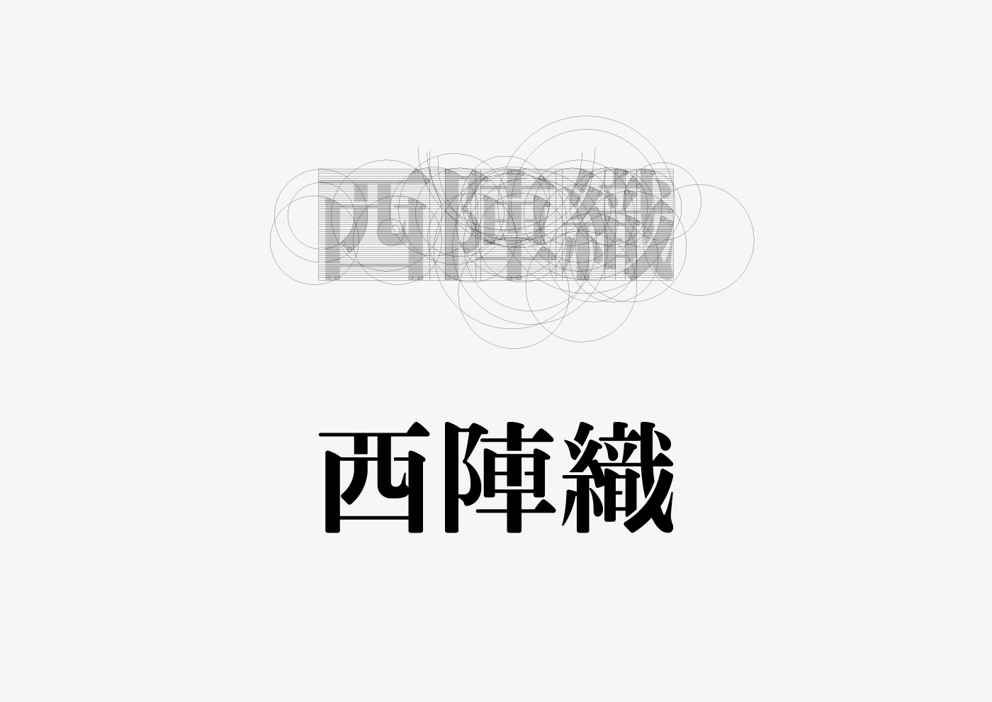
Concept of Custom Typeface
With 1500 years of long history and tradition, for its high quality Nishijin-ori were substantial to the imperial and aristocrats. However, although Nishijin-ori is synonymous to luxury silk in Japan, it is also a fact that having just tradition and quality is starting to be not enough to keep it standing. For such reason, from now on Nishijin-ori, whose existing customer is the wealthy, must look for a wider market such as casual youngs and overseas. In order to do so, traditional and innovative, the two faces should be held together. As Nishijin-ori was until now, keeping the tradition and also accepting changes will yarn its future.
As the new typeface of Nishijin-ori, differentiates two types of characters (Serif / Sans-serif) are combined. By doing so, traditional and innovative, the double faced Nishijin-ori revealed itself. Also, the new Nishinjin-ori attitude of overcoming difficulties and barriers is expressed by cutting off a part of the typeface. Thus, still having good traditional feel, a new typeface with casual playfulness is born.
約1,500年もの長い歴史と伝統を持つ西陣織は, その高い品質から朝廷や貴族からも重用された. 日本において高級絹織物の代名詞である西陣織は, 様々な要因によって伝統や品質だけでは立ち行かなくなってきていることも事実である. そのため, これからの西陣織は既存顧客層である富裕層のみならず, カジュアルな若い世代や海外へと広く販路を見出していく必要があるであろう. そのためには, 伝統的/革新的という2つの側面を併せ持つべきである. これまでの西陣織がそうであったように, 伝統を守りながらも変化を採り入れ, 未来を紡いでいくのである.
西陣織の新しいタイプフェイスでは, 性質の違う2種類 (明朝/ゴシック) の文字を融合した. これにより, 伝統的/革新的という2つの側面を併せ持った新しい西陣織の姿を表した. さらに, 立ちはだかる困難や障壁を超え進んでいくこれからの西陣織の姿勢を, 文字要素の一部をカットすることで表現した. これらにより, しっかりと伝統を感じさせながらもカジュアルな遊び心を併せ持った新しいタイプフェイスが生まれた.
Concept of Custom Typeface
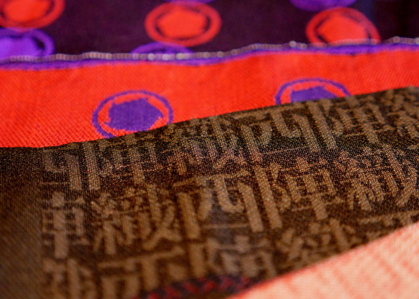
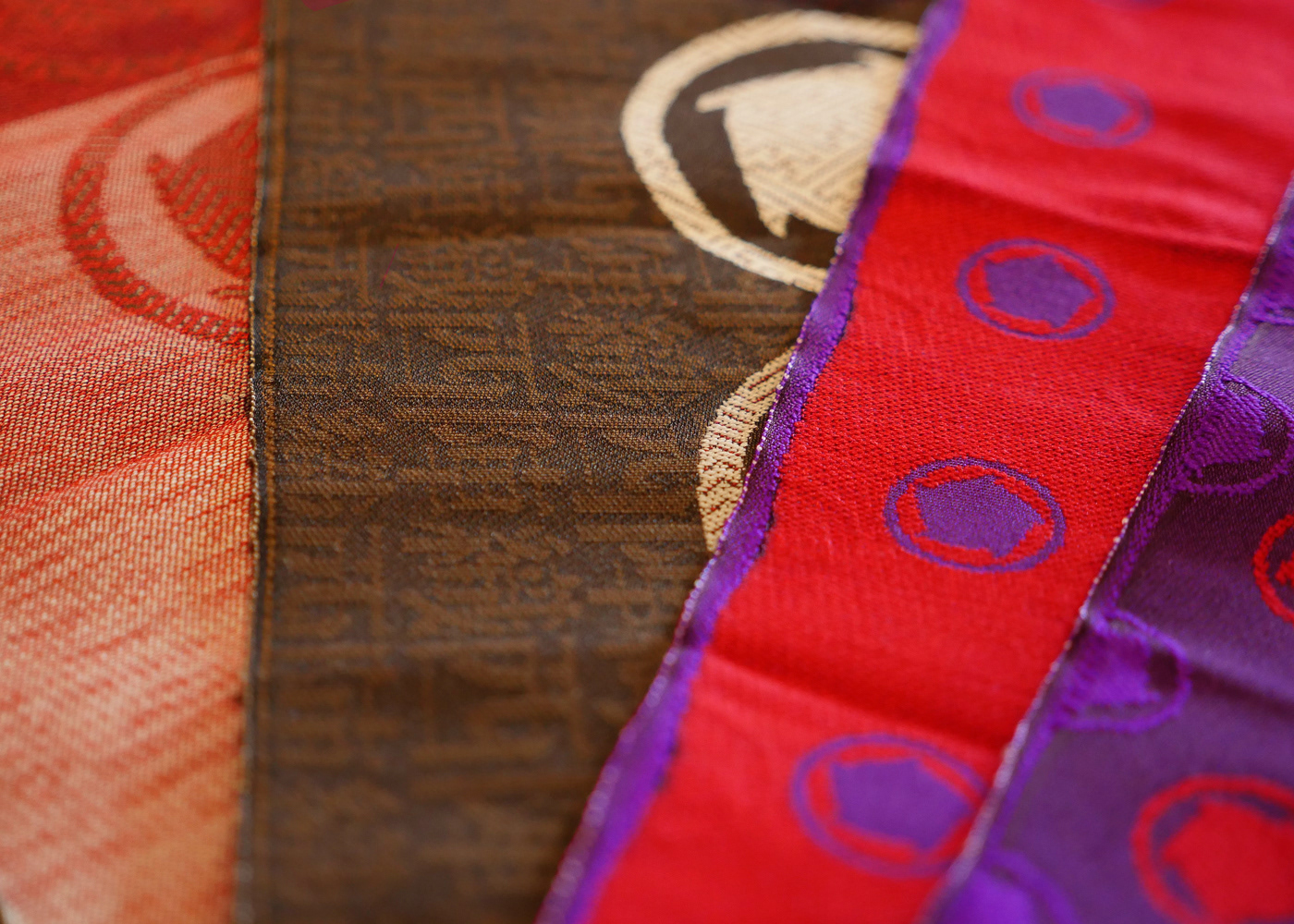
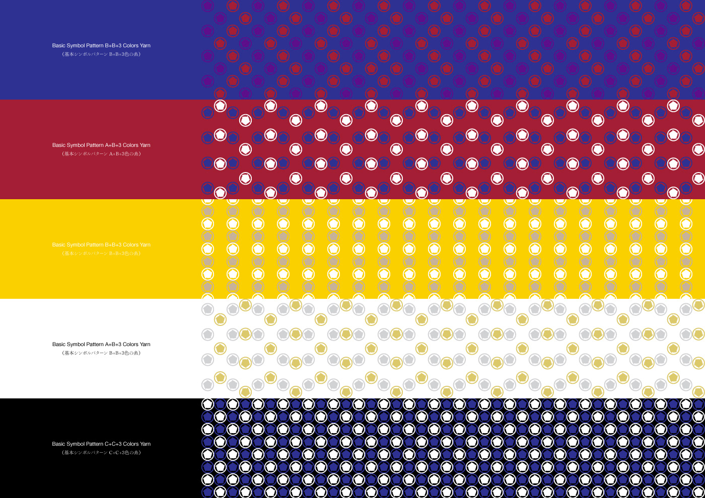
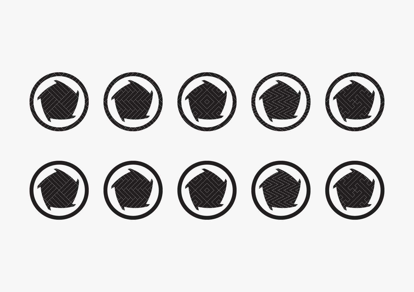
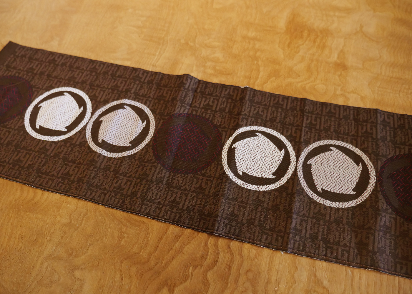
Basic Symbol Patterns
There are three basic symbol patterns with regularly tiled symbols. The Monyou (traditional Japanese pattern) varies by combining the symbol patterns.
When one basic symbol pattern refers to an element "tradition of Nishijin-ori", element "newness" or "innovation" should be the pairing pattern. Also, if each symbol in the basic symbol pattern represents "craftsmen and producers" involved in the current Nishijin-ori, each symbol in the paring pattern would represent "domestic and international academics and creators with whole new perspectives and ideas". Such combinations create the new change (Monyou) in Nishijin-ori. These patterns symbolize the Nishijin-ori itself being reborn towards the new era, while still inheriting its tradition. Moreover, by combining the newly emerged patterns with diverse colors of silk and various “Mon” fabrics, further more variation emerges.
When one basic symbol pattern refers to an element "tradition of Nishijin-ori", element "newness" or "innovation" should be the pairing pattern. Also, if each symbol in the basic symbol pattern represents "craftsmen and producers" involved in the current Nishijin-ori, each symbol in the paring pattern would represent "domestic and international academics and creators with whole new perspectives and ideas". Such combinations create the new change (Monyou) in Nishijin-ori. These patterns symbolize the Nishijin-ori itself being reborn towards the new era, while still inheriting its tradition. Moreover, by combining the newly emerged patterns with diverse colors of silk and various “Mon” fabrics, further more variation emerges.
As a proud tradition of Japan, many people would be involved in Nishijin-ori from now on. By adopting unexpected new ideas, creation and technology, it will always continue to innovate while inheriting the tradition.
The future of Nishijin-ori is not just one. Patterns with diversity is to show such aspect.
The future of Nishijin-ori is not just one. Patterns with diversity is to show such aspect.
シンボルを規則正しくタイリングした3つの基本シンボルパターンを用意した. この小紋パターンは,組み合わることで文様が変化する.
基本シンボルパターンのひとつを”西陣織の伝統”という要素として捉えるならば, 組み合わせる基本シンボルパターンは”新しさ”や”革新”という要素である. また, 基本シンボルパターン内のシンボルひとつひとつを現在の西陣織に関わる"職人達や生産業者"という要素として捉えるならば, 組み合わせる基本シンボルパターン内のひとつひとつは, "まったく新しい視点やアイデアを持った国内外のアカデミックやクリエイター"という要素である. これらが組み合わさることで西陣織に新しい変化 (文様) が生まれる. これらのパターンは, 伝統を継承しながら新しい時代へむけて生まれ変わる西陣織の姿そのものの象徴である. さらに, 新しく生まれたパターンに多様な色の絹糸やさまざまな紋織を組み合わせることで, より多くのバリエーションが生まれる.
日本が誇る伝統である西陣織には, これからも多くの人が関わっていくだろう. そして, 思いがけない新しいアイデアやクリエーション, 技術を採り入れることで, これからも伝統を継承しながら, 常に革新し続けていくに違いない.
西陣織の未来の姿は決してひとつではない. パターンに多様性を持たせたのはそれを示すためである.

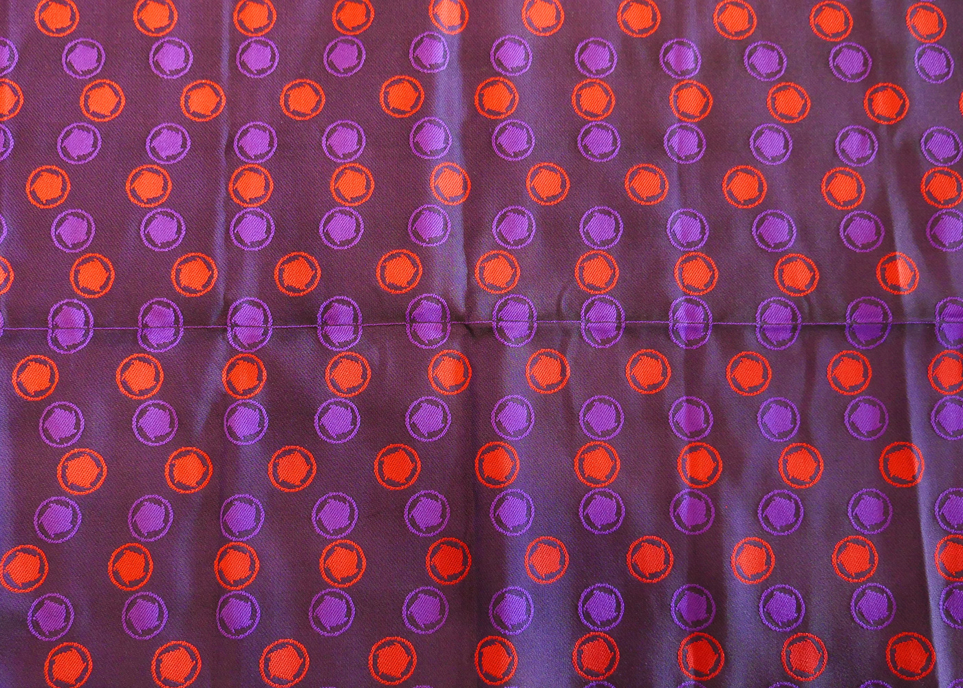
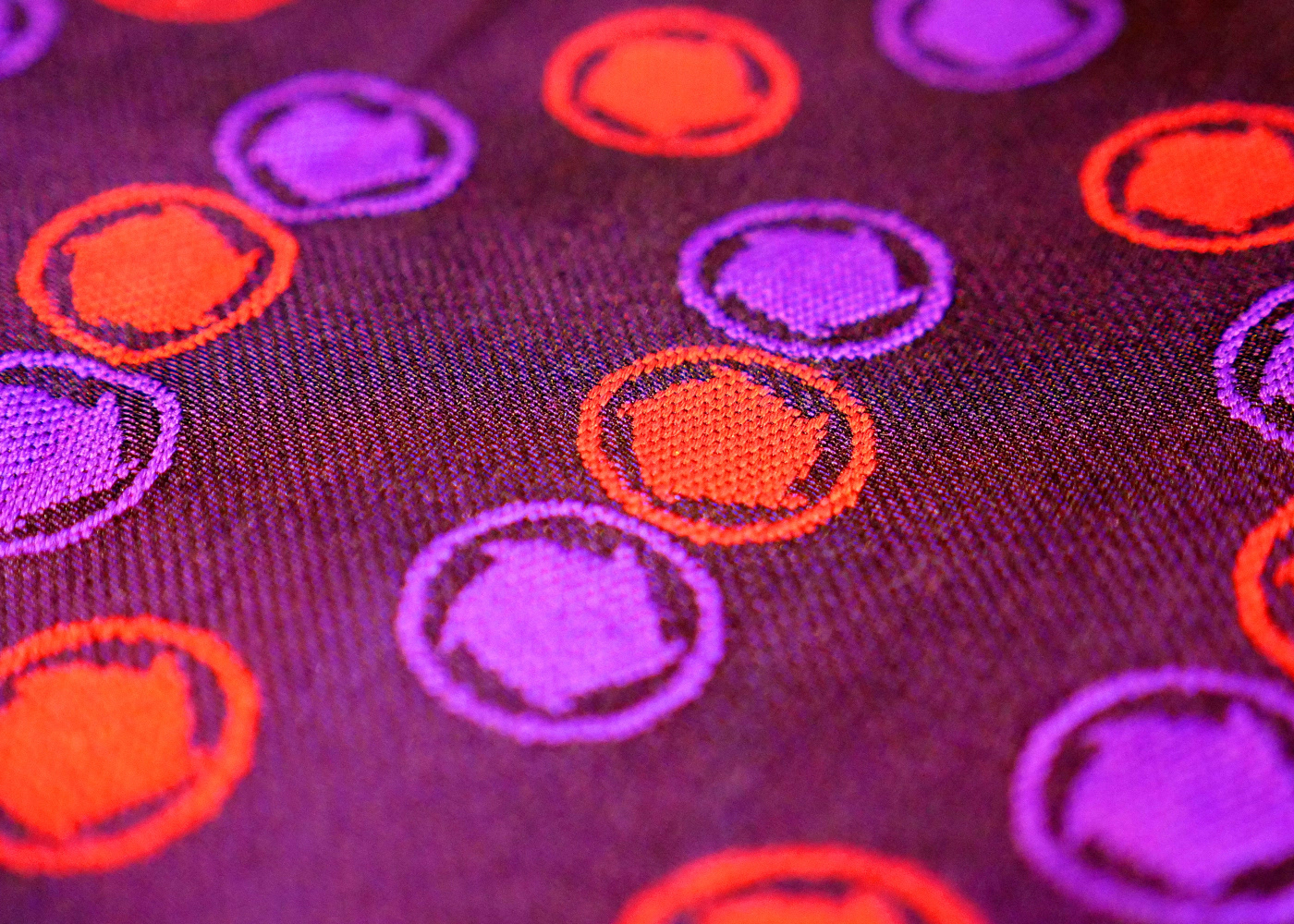
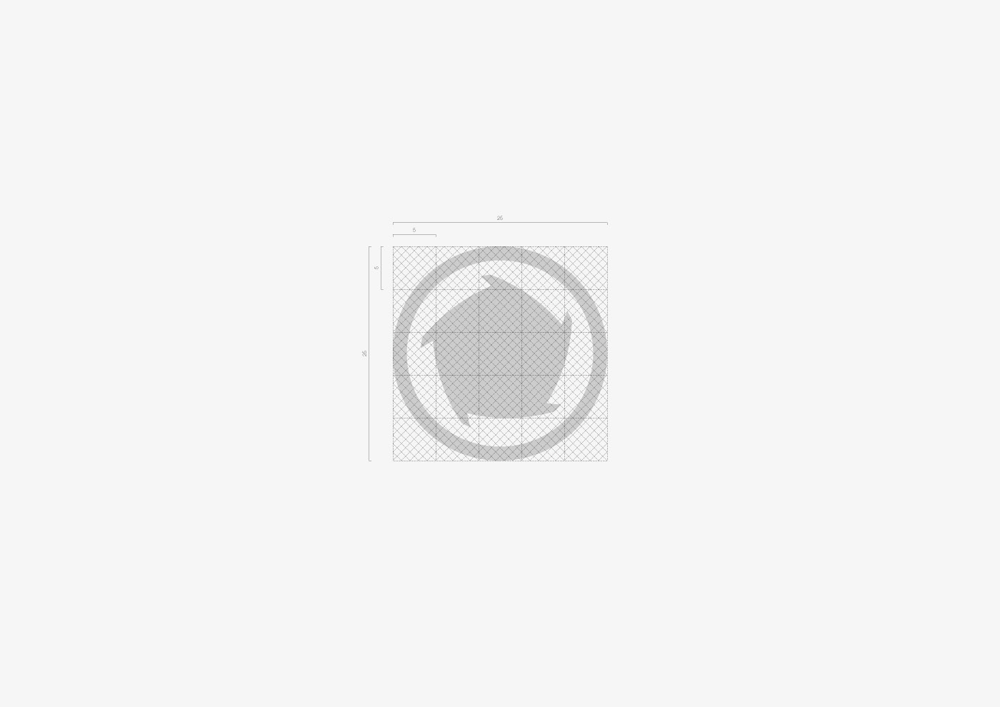
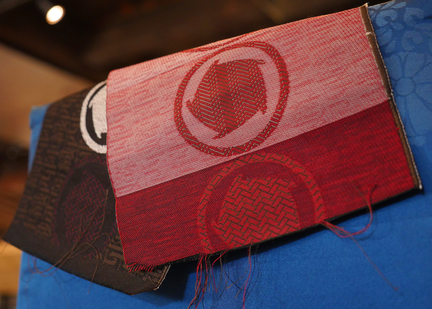
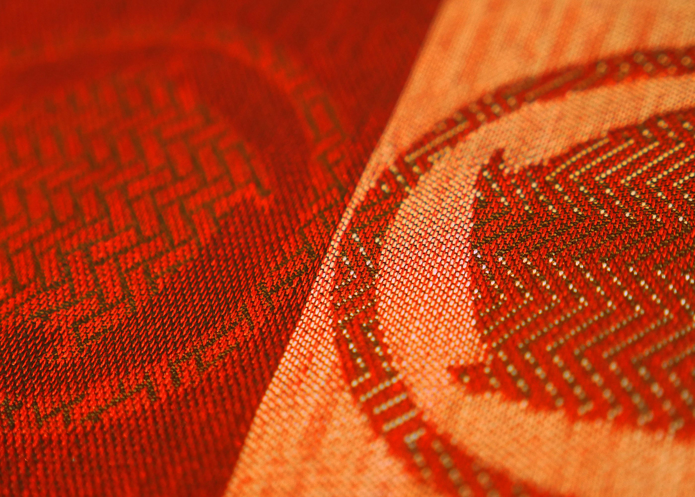
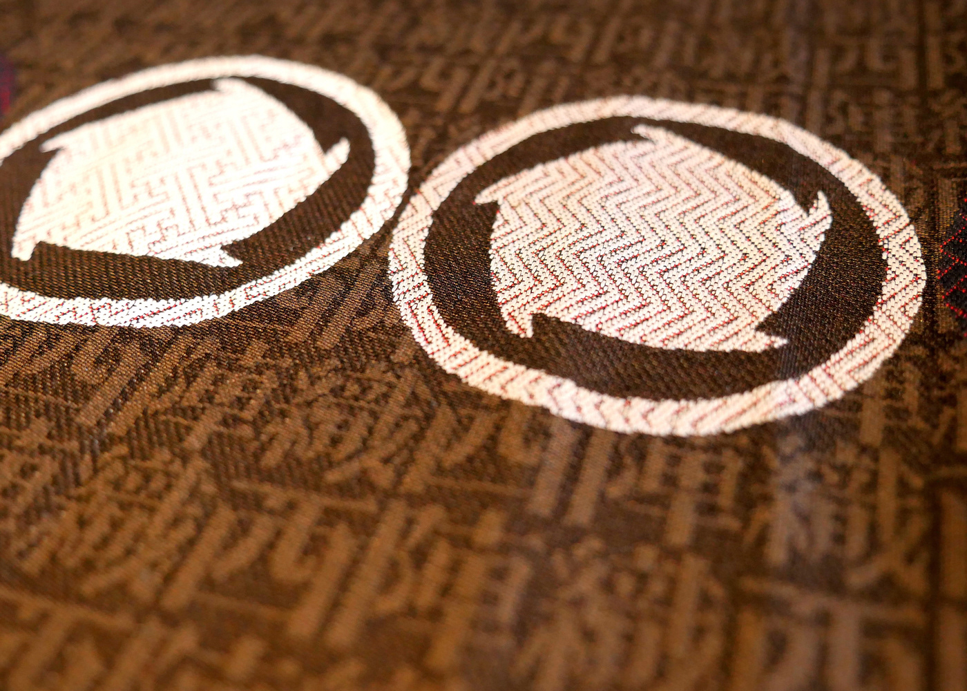
Hari-toji: Needle Bind Pattern
As another pattern, we created a pattern within a symbol based on "Hari-toji technique" which is frequently used in Nishijin-ori. "Hari-toji” is a sewing technique to prevent the large pattern from floating off the fabric, which is possible with the delicate and sophisticated craftsmanship.
For such "Hari-toji pattern", our newly created a grid based on “five” which is one component of the symbol.
For such "Hari-toji pattern", our newly created a grid based on “five” which is one component of the symbol.
もうひとつのパターンとして, 西陣織で多用される”針とじ技法”を基にしたシンボル内パターンを作成した. “針とじ技法”とは, 織物内の大きな文様が生地から浮くのを抑えるために生地へと縫い付ける際の技法であり, 繊細で精緻な技巧があって初めて存在する. この”針とじパターン”のために, シンボルの構成要素のひとつである5を基にしたグリッドを新しく作成した.


Client: Loftwork Inc. / Nishijin Rengou Seinen-kai
Range of Work: Logo System & Concept Development
Creative Director: Shinya Kunihiro (Loftwork Inc.)
Art Direction & Graphic Design: Hiromi Maeo (enhanced Inc.)
Photo: Loftwork Inc.
Movie: Toshiki Nonaka
2016 Kyoto, Japan
2016 Kyoto, Japan